Icon - Arrow LeftAn icon we use to indicate a rightwards action. Icon - Arrow RightAn icon we use to indicate a leftwards action. Icon - External LinkAn icon we use to indicate a button link is external. Icon - MessageThe icon we use to represent an email action. Icon - Down ChevronUsed to indicate a dropdown. Icon - CloseUsed to indicate a close action. Icon - Dropdown ArrowUsed to indicate a dropdown. Icon - Location PinUsed to showcase a location on a map. Icon - Zoom OutUsed to indicate a zoom out action on a map. Icon - Zoom InUsed to indicate a zoom in action on a map. Icon - SearchUsed to indicate a search action. Icon - EmailUsed to indicate an emai action. Icon - FacebookFacebooks brand mark for use in social sharing icons. flipboard Icon - InstagramInstagrams brand mark for use in social sharing icons. Icon - PinterestPinterests brand mark for use in social sharing icons. Icon - TwitterTwitters brand mark for use in social sharing icons. Icon - Check MarkA check mark for checkbox buttons.
You are reading

Paint Colors for Iron Gates and Fences

Search

Paint Colors for Iron Gates and Fences

March 25, 2018

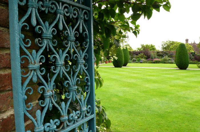
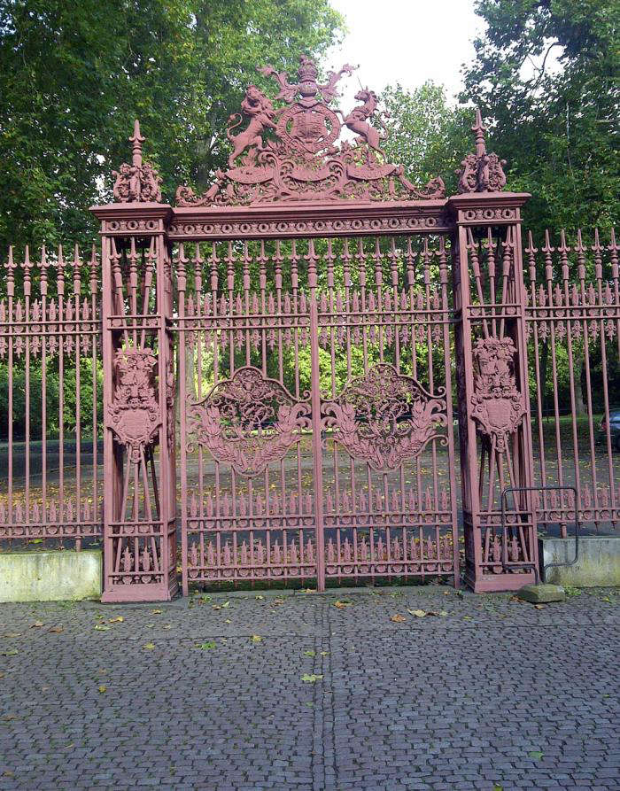
The head gardener at a large country estate recently asked me what color I’d paint the newly restored gates and railings. I didn’t know what to say. Aren’t railings always black?

Before the middle of the 20th century, ironwork was not black. It was much more likely to be green, gray, or red-brown. A fast-drying black was invented in the 1930s; it was used in architectural circles but there was a slow general take up, due to the war and consequent austerity. Now it is the rule. However, with more research into historical paint colors, the original and often surprising hues are being revived. Patrick Baty, aka Colourman, is no stranger to restoration projects on the grand scale. He takes us on a stroll through town and country and opens our eyes to the knotty subject of painted ironwork.

Photography by Patrick Baty, except where noted.

Above: A gate at Sissinghurst Castle, painted a lively blue. This color would have been chosen in the 1930s when the Nicolsons created the garden, as a nod to an earlier palette. Photograph by Kendra Wilson.
Above: Number One London, the home of the Duke of Wellington. “The railings of Apsley House were examined in the 1980s and the original light bronze color was uncovered and reproduced,” explains Baty. “It caused quite a stir at the time as no one could remember them having been anything but black.”
Above: Bronze-green was the color of choice for smart ironwork in the 18th century. Bronze dust was sometimes mixed in with the green for accent. Baty was involved in restoring this color and the red of the Queen’s Gates, below. “We produce the colors for those people who are interested,” he says. Interested parties should contact the Baty family business Papers & Paints, who do not produce color cards.
Above: Detail of the Queen’s Gates, at one of the entrances to Kensington Gardens in London, as they stand today. In the mid-19th century, a red lead primer was developed to battle corrosion, which was then covered with a few layers of iron oxide paint. Shades of earthy red as the finished color began to make an appearance.
Above: The Queen’s Gates after restoration. “The same color has been found on the external ironwork of nearby buildings and was in use from the 1870s until World War Two,” Baty says.
Above: Blue Coats School. “The color on the railings was known as ‘lead color’ and is found on many 18th-century railings.” Humphrey Repton, the British landscape architect who became influential at that time, decreed that it was pointless to paint something made of iron the color of an inferior metal like lead.
Above: Far better to use bronze green, shown, or invisible green, which “was never just one color but any dull green that worked well against a leafy background,” says Baty.
Above: The Carlton Club, London. Colored railings look fantastic on stand-alone buildings, but it is considered antisocial if you live in a terrace or square, to paint the railings outside your house an individual color.
Above: A glorious gate in the garden at Rousham, near Oxford. “The color used here is Prussian blue. Such a color is found occasionally on 18th-century ironwork.” More of this, please.
Above: The railings of the Foreign Office, pre–Patrick Baty. After taking samples he discovered that they had been Venetian red for about the first forty years and, thankfully, they were stripped back and the color reinstated.
Above: The glorious Venetian red ironwork of the Foreign Office. There is a myth that Queen Victoria’s mourning of Albert led to the funereal appearance of ironwork in the UK. In fact, technology allowed its introduction in the 1930s and British architect Basil Ionides decreed: “All ornamental ironwork on the outside of a house should be black.” Time for a rethink?

Finally, learn how to successfully design a fence for any landscape or garden project with our guide to Hardscaping 101: Fences & Gates.

See more ideas for Fences & Gates 101 in our curated guides to Hardscape 101, including:

(Visited 3,230 times, 14 visits today)
You need to login or register to view and manage your bookmarks.

Have a Question or Comment About This Post?

Join the conversation

v5.0