Icon - Arrow LeftAn icon we use to indicate a rightwards action. Icon - Arrow RightAn icon we use to indicate a leftwards action. Icon - External LinkAn icon we use to indicate a button link is external. Icon - MessageThe icon we use to represent an email action. Icon - Down ChevronUsed to indicate a dropdown. Icon - CloseUsed to indicate a close action. Icon - Dropdown ArrowUsed to indicate a dropdown. Icon - Location PinUsed to showcase a location on a map. Icon - Zoom OutUsed to indicate a zoom out action on a map. Icon - Zoom InUsed to indicate a zoom in action on a map. Icon - SearchUsed to indicate a search action. Icon - EmailUsed to indicate an emai action. Icon - FacebookFacebooks brand mark for use in social sharing icons. flipboard Icon - InstagramInstagrams brand mark for use in social sharing icons. Icon - PinterestPinterests brand mark for use in social sharing icons. Icon - TwitterTwitters brand mark for use in social sharing icons. Icon - Check MarkA check mark for checkbox buttons.
You are reading

Expert Advice: An Architectural Designer’s Favorite Statement-Making Front Door Colors

Search
Advertisement
The Home Depot Logo 300x180

Expert Advice: An Architectural Designer’s Favorite Statement-Making Front Door Colors

August 22, 2018

A few weeks ago, architectural and interior designer Katie Hackworth gave us a master class on facade facelifts with a fresh coat of paint. (See her advice in Expert Advice: Three No-Fail Palettes for Instant Curb Appeal.) Her neutral palettes felt so fresh and inspired that we went back to ask how to adapt them for homeowners who want to make a bigger statement. An easy (and low-commitment) way: A bold splash of color and contrast with a strong color on the front door. These are Katie’s bold color picks, each designed to complement her foolproof curb appeal palettes.

Photography by Mel Walbridge for Gardenista. Produced and styled by Oliver Agger.

Classic White

Katie&#8\2\17;s classic white exterior palette hinged on a facade painted Behr&#8\2\17;s Ivory Palace. For a (quiet) statement on the front door, she chose Behr&#8\2\17;s Woodland Sage, a pale blue-green tone that&#8\2\17;s unexpected without feeling too outlandish.
Above: Katie’s classic white exterior palette hinged on a facade painted Behr’s Ivory Palace. For a (quiet) statement on the front door, she chose Behr’s Woodland Sage, a pale blue-green tone that’s unexpected without feeling too outlandish.

“If you’re up for making a statement,” says Katie, “a dusty rose or a blue-green tone will be sure to catch your neighbors’ attention. Both colors are unique enough to stand out, but remain in good taste and reference small European neighborhoods. That’s always a good thing!”

Another of Katie&#8\2\17;s picks to complement Ivory Palace: Behr&#8\2\17;s Apricotta, a crowd-pleasing dusty rose.
Above: Another of Katie’s picks to complement Ivory Palace: Behr’s Apricotta, a crowd-pleasing dusty rose.

Dark & Moody

&#8\2\20;Navy just might be my all-time favorite color. These days, I’m seeing it more and more frequently on the exteriors of homes,&#8\2\2\1; says Katie. For her dark palette, she chose Behr&#8\2\17;s Undersea for the facade color and suggests Behr&#8\2\17;s Lamplit if you&#8\2\17;re up for making a statement on your front door.
Above: “Navy just might be my all-time favorite color. These days, I’m seeing it more and more frequently on the exteriors of homes,” says Katie. For her dark palette, she chose Behr’s Undersea for the facade color and suggests Behr’s Lamplit if you’re up for making a statement on your front door.

Says Katie: “An unexpected yellow can be a fun, welcoming pop of color for your home’s front door, while still classic alongside a navy exterior. You want to stay away from yellows that read too bright or too orange. If you’re up for making a dramatic statement, try committing to all dark and painting the front door a dark black tone.”

If you&#8\2\17;re ready to commit to a completely dark exterior, Katie suggests Behr&#8\2\17;s Little Black Dress for the front door. &#8\2\20;You can add to the drama by painting all of the window sashes and muntins in the same dark hue,&#8\2\2\1; she says.
Above: If you’re ready to commit to a completely dark exterior, Katie suggests Behr’s Little Black Dress for the front door. “You can add to the drama by painting all of the window sashes and muntins in the same dark hue,” she says.

Going Green

&#8\2\20;If anyone knows my work, they know I have a thing for green,&#8\2\2\1; Katie says. To complement a facade painted Behr&#8\2\17;s Jungle Camouflage, she chose Behr&#8\2\17;s Russian Olive. &#8\2\20;It’s a rich, deep, and tasteful green that will definitely stand out without asking for too much attention,&#8\2\2\1; she says.
Above: “If anyone knows my work, they know I have a thing for green,” Katie says. To complement a facade painted Behr’s Jungle Camouflage, she chose Behr’s Russian Olive. “It’s a rich, deep, and tasteful green that will definitely stand out without asking for too much attention,” she says.

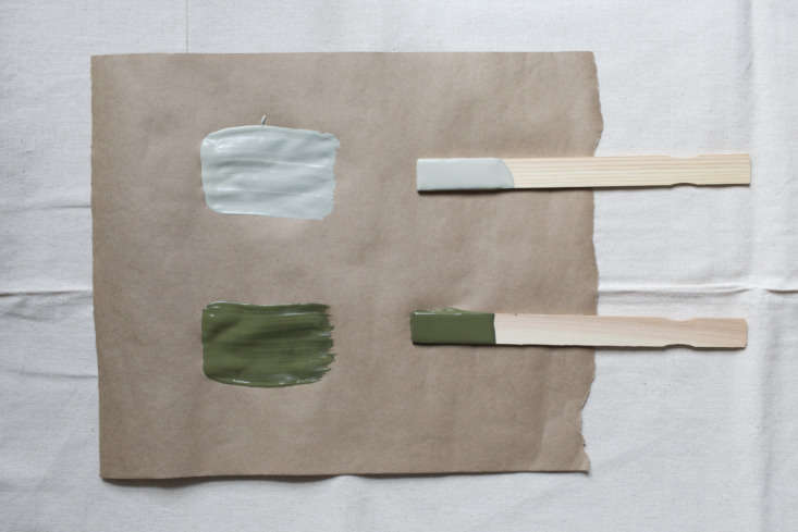
“If you’re ready to really commit to green, as I seem to be, try painting your front door (as well as your window sashes and muntins) a dark olive green tone,” says Katie, “or go one step further and paint the front door a bold orange tone.”

The boldest of Katie&#8\2\17;s color combinations: Behr&#8\2\17;s Tiki Torch paired with Jungle Camouflage. Says Katie: &#8\2\20;In this case, you will be asking for the attention, but it will be well deserved!&#8\2\2\1;
Above: The boldest of Katie’s color combinations: Behr’s Tiki Torch paired with Jungle Camouflage. Says Katie: “In this case, you will be asking for the attention, but it will be well deserved!”
(Visited 372 times, 1 visits today)
You need to login or register to view and manage your bookmarks.

v5.0