Icon - Arrow LeftAn icon we use to indicate a rightwards action. Icon - Arrow RightAn icon we use to indicate a leftwards action. Icon - External LinkAn icon we use to indicate a button link is external. Icon - MessageThe icon we use to represent an email action. Icon - Down ChevronUsed to indicate a dropdown. Icon - CloseUsed to indicate a close action. Icon - Dropdown ArrowUsed to indicate a dropdown. Icon - Location PinUsed to showcase a location on a map. Icon - Zoom OutUsed to indicate a zoom out action on a map. Icon - Zoom InUsed to indicate a zoom in action on a map. Icon - SearchUsed to indicate a search action. Icon - EmailUsed to indicate an emai action. Icon - FacebookFacebooks brand mark for use in social sharing icons. flipboard Icon - InstagramInstagrams brand mark for use in social sharing icons. Icon - PinterestPinterests brand mark for use in social sharing icons. Icon - TwitterTwitters brand mark for use in social sharing icons. Icon - Check MarkA check mark for checkbox buttons.
You are reading

Expert Advice: Three No-Fail Palettes for Instant Curb Appeal

Search
Advertisement
The Home Depot Logo 300x180

Expert Advice: Three No-Fail Palettes for Instant Curb Appeal

August 8, 2018

A few months ago, over on Remodelista, the editors praised the power of paint for its ability to instantly reframe an interior space without committing to a full remodel. To prove their point, architectural and interior designer Katie Hackworth weighed in with three no-fail color palettes for a room’s ceiling, walls, and trim (see her picks here). It got us thinking: Could a fresh coat of paint provide an instant curb appeal upgrade as well? We went back to Katie to ask her advice and she responded right away with a resounding “yes!” and a few of her favorite exterior color combinations for your facade, exterior trim, and front door.

Photography by Mel Walbridge for Gardenista. Produced and styled by Oliver Agger.

Above: Curb appeal color palettes for any style of architecture. From left: a classic white, a dramatic palette hinged on navy, and a muted green palette that still reads neutral.

Classic White

Above: For a mostly white palette that would work for a traditional or modern home, Katie chose Behr’s Ivory Palace in a flat finish for the main house color, accented by the same tone in satin for the exterior trim. Behr’s Black in semi-gloss is a classic front door choice to accent a warm white exterior.

For a classic, can’t-go-wrong white palette, Katie leans toward whites that have some warmth, without reading yellow or pink. “Lately I’ve been gravitating toward painting the main house and the trim the same color but with different sheens,” she says. “Whether your home is traditionally detailed or more pared down, it’s a timeless way to modernize the overall look.”

Above: Black is a no-brainer when it comes to front door color on a warm white home. “You can’t go wrong,” says Katie. Shown, from top: front door, exterior trim, and main house.

Dark & Moody

Above: A stately navy palette includes Behr’s Undersea in flat finish for the main house color, the same tone in its satin finish for the trim, and Behr’s Exclusive Ivory in satin for a fresh front door.

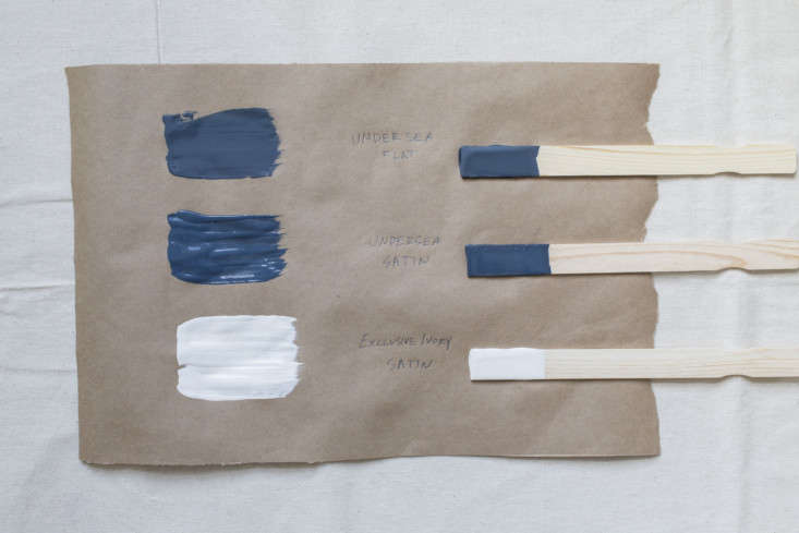
For a dose of drama that still reads classic, Katie designed a palette anchored by a navy blue main house color. “Navy just might be my all-time favorite color,” she says. “These days, I’m seeing it more and more frequently on the exteriors of homes.”

Above: “For a fresh and welcoming approach, a soft white painted door will always make an agreeable pairing,” Katie says. Shown, from top: main house, exterior trim, and front door.

Going Green

Above: “If anyone knows my work, they know I have a thing for green,” says Katie. For a green palette that leans toward neutral, she chose Behr’s Jungle Camouflage in a flat finish for the main house color, Behr’s High Style Beige in semi-gloss for the exterior trim, and Behr’s Broadway in satin for the front door.

For a nonwhite palette, Katie chose a muted gray-green (the new neutral, if you ask us), accented by a putty tone for the exterior trim. “Putty is the cool, classic term for beige in my book,” Katie admits. “It sounds so much better, don’t you think?”

Above: “I chose a classic black with green undertones for the front door. It’s understated green at its best!” Shown, from top: main house, exterior trim, and front door.

Katie’s no-fail palettes are all fairly neutral—classic combinations that don’t call attention to themselves. If you’re up for making a statement, stay tuned in the next few weeks for her favorite bold front-door colors.

(Visited 326 times, 1 visits today)
You need to login or register to view and manage your bookmarks.

v5.0