Icon - Arrow LeftAn icon we use to indicate a rightwards action. Icon - Arrow RightAn icon we use to indicate a leftwards action. Icon - External LinkAn icon we use to indicate a button link is external. Icon - MessageThe icon we use to represent an email action. Icon - Down ChevronUsed to indicate a dropdown. Icon - CloseUsed to indicate a close action. Icon - Dropdown ArrowUsed to indicate a dropdown. Icon - Location PinUsed to showcase a location on a map. Icon - Zoom OutUsed to indicate a zoom out action on a map. Icon - Zoom InUsed to indicate a zoom in action on a map. Icon - SearchUsed to indicate a search action. Icon - EmailUsed to indicate an emai action. Icon - FacebookFacebooks brand mark for use in social sharing icons. flipboard Icon - InstagramInstagrams brand mark for use in social sharing icons. Icon - PinterestPinterests brand mark for use in social sharing icons. Icon - TwitterTwitters brand mark for use in social sharing icons. Icon - Check MarkA check mark for checkbox buttons.
You are reading

Expert Advice: Architects Favorite Exterior Color Palettes

Search

Expert Advice: Architects Favorite Exterior Color Palettes

May 21, 2019

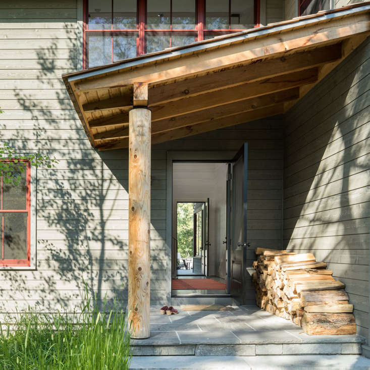
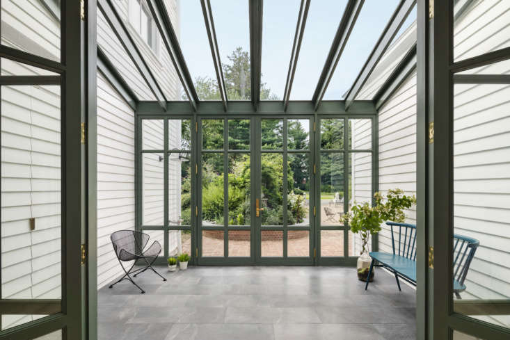
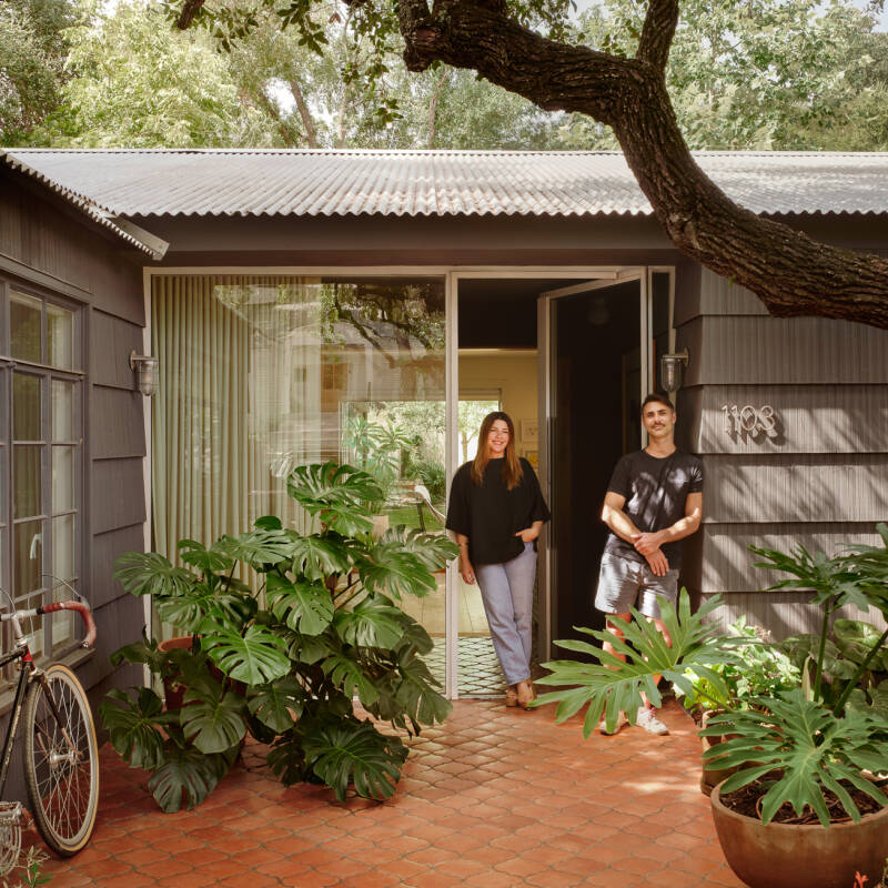
Exterior paint palettes are tricky. Colors appear different in both direct sunlight and full shadow (making neutrals tough to decide on). And of course, the decision feels more permanent (and more of an investment) than interior colors. With all this in mind, we turned to a group of architects for their favorite exterior palettes. Here’s what they told us:

Architect Hope Dana of New York-based Platt Dana Architects cites wine red and warm gray as a favorite color combination. In the firm&#8\2\17;s recent project in Jackson Hole, Wyoming, the Benjamin Moore Arborcoat Exterior Stain in Amherst Gray HC-\167 was paired with Marvin Windows in a wineberry aluminum-clad material. &#8\2\20;The color palette was carefully considered for both summer and winter months. The summer months are lush with Arctic Willows and Aspen trees; the earthy palette of the house blends in with the surroundings. And in the snow-covered winter months, the red windows stand out against the snow and bright blue sky,&#8\2\2\1; says Dana.
Above: Architect Hope Dana of New York-based Platt Dana Architects cites wine red and warm gray as a favorite color combination. In the firm’s recent project in Jackson Hole, Wyoming, the Benjamin Moore Arborcoat Exterior Stain in Amherst Gray HC-167 was paired with Marvin Windows in a wineberry aluminum-clad material. “The color palette was carefully considered for both summer and winter months. The summer months are lush with Arctic Willows and Aspen trees; the earthy palette of the house blends in with the surroundings. And in the snow-covered winter months, the red windows stand out against the snow and bright blue sky,” says Dana.
&#8\2\20;Our go-to exterior paint colors are Benjamin Moore Gloucester Sage and Benjamin Moore Iron Mountain,&#8\2\2\1; says Los Angeles architect Oonagh Ryan. Shown here, Gloucester Sage (HC-\100) was used to color the cement plaster on the house. &#8\2\20;It&#8\2\17;s a warm neutral that picks up natural landscape tones and doesn&#8\2\17;t feel washed out in the strong California sunshine,&#8\2\2\1; she says. The steel windows on the house are then painted with Iron Mountain (\2\134-30). &#8\2\20;It&#8\2\17;s a warm gray that works well with the highlights of the cement plaster, and is very close in tone to natural steel.&#8\2\2\1; Photograph by Eric Staudenmaier Photography courtesy of Oonagh Ryan.
Above: “Our go-to exterior paint colors are Benjamin Moore Gloucester Sage and Benjamin Moore Iron Mountain,” says Los Angeles architect Oonagh Ryan. Shown here, Gloucester Sage (HC-100) was used to color the cement plaster on the house. “It’s a warm neutral that picks up natural landscape tones and doesn’t feel washed out in the strong California sunshine,” she says. The steel windows on the house are then painted with Iron Mountain (2134-30). “It’s a warm gray that works well with the highlights of the cement plaster, and is very close in tone to natural steel.” Photograph by Eric Staudenmaier Photography courtesy of Oonagh Ryan.
&#8\2\20;In our exterior work, we tend to showcase the natural colors of materials—red brick, gray concrete, rusty Corten steel—and leave the painted portions as a neutral backdrop,&#8\2\2\1; says Brooklyn firm Delson or Sherman Architects. &#8\2\20;That said, we occasionally make an exception.&#8\2\2\1; In Brooklyn&#8\2\17;s Prospect Heights, the architects chose Benjamin Moore&#8\2\17;s Hearthstone (\160\1) for the trim work. The cool blue-gray &#8\2\20;amplifies the warm tones of brick and brownstone,&#8\2\2\1; they say. &#8\2\20;This is a classic pairing you find all over the South, thought it&#8\2\17;s less common in Brooklyn.&#8\2\2\1;
Above: “In our exterior work, we tend to showcase the natural colors of materials—red brick, gray concrete, rusty Corten steel—and leave the painted portions as a neutral backdrop,” says Brooklyn firm Delson or Sherman Architects. “That said, we occasionally make an exception.” In Brooklyn’s Prospect Heights, the architects chose Benjamin Moore’s Hearthstone (1601) for the trim work. The cool blue-gray “amplifies the warm tones of brick and brownstone,” they say. “This is a classic pairing you find all over the South, thought it’s less common in Brooklyn.”
In a house in Larchmont, New York, Brooklyn firm O&#8\2\17;Neill Rose Architects worked with a palette of strong greens and a neutral base white to &#8\2\20;relate to the lush greenery that surrounds the house,&#8\2\2\1; they say. Shown here in the greenhouse, Benjamin Moore Caldwell Green (HC-\1\24) &#8\2\20;draws in the garden beyond and unifies the blue-gray schist of the greenhouse floor and brick ground plane beyond.&#8\2\2\1; The architects tested a variety of whites for the exterior by painting swatches at each light exposure and observing the color throughout the day. &#8\2\20;This was the white that responded the best to all light conditions; the most natural, crisp, not too stark, but not dingy either.&#8\2\2\1; It&#8\2\17;s Benjamin Moore White Heron (OC-57). Photograph by Michael Moran courtesy of O&#8\2\17;Neill Rose Architects.
Above: In a house in Larchmont, New York, Brooklyn firm O’Neill Rose Architects worked with a palette of strong greens and a neutral base white to “relate to the lush greenery that surrounds the house,” they say. Shown here in the greenhouse, Benjamin Moore Caldwell Green (HC-124) “draws in the garden beyond and unifies the blue-gray schist of the greenhouse floor and brick ground plane beyond.” The architects tested a variety of whites for the exterior by painting swatches at each light exposure and observing the color throughout the day. “This was the white that responded the best to all light conditions; the most natural, crisp, not too stark, but not dingy either.” It’s Benjamin Moore White Heron (OC-57). Photograph by Michael Moran courtesy of O’Neill Rose Architects.
Architecture Workshop led by partners Robert Garneau and Eric Ansel worked with two gray tones for the lobby entrance to a New York apartment building. The gray steel framing is TNEMEC Endura-Shield Series 73 4\1GR Hammerhead and the façade stucco is BASF Thoro Wall Coatings Sesame 47\2-P. &#8\2\20;We like this color palette for its warm tone and how it evokes materials like raw steel and limestone,&#8\2\2\1; Garneau explains. &#8\2\20;Exposing steel was considered, but due to maintenance concerns we chose to paint with a high performance coating while retaining the essence of the steel frame. The warm, dark gray color (Sesame) looks very different depending on the sun, ranging from cool gray to a bronze appearance. And the warm gray metal paint (Hammerhead) integrates effortlessly with the surrounding beige-colored façade and concrete sidewalk.&#8\2\2\1;
Above: Architecture Workshop led by partners Robert Garneau and Eric Ansel worked with two gray tones for the lobby entrance to a New York apartment building. The gray steel framing is TNEMEC Endura-Shield Series 73 41GR Hammerhead and the façade stucco is BASF Thoro Wall Coatings Sesame 472-P. “We like this color palette for its warm tone and how it evokes materials like raw steel and limestone,” Garneau explains. “Exposing steel was considered, but due to maintenance concerns we chose to paint with a high performance coating while retaining the essence of the steel frame. The warm, dark gray color (Sesame) looks very different depending on the sun, ranging from cool gray to a bronze appearance. And the warm gray metal paint (Hammerhead) integrates effortlessly with the surrounding beige-colored façade and concrete sidewalk.”
A favorite combination from Connecticut firm Hendricks Churchill is Farrow & Ball colors Purbeck Stone (\275), Inchyra Blue (\289), and Black Blue (95). Seen here, the entire house is painted in Purbeck Stone (including the siding, trim, sash, and gutters). &#8\2\20;It&#8\2\17;s an easy and versatile neutral gray that reads more like a warm white. It&#8\2\17;s a shade that is true to its name and has a powdery softness to it that also minimizes many of the surface imperfections on an old historical house&#8\2\17;s exterior,&#8\2\2\1; says Heide Hendricks. Inchyra Blue is then used on exterior doors and Black Blue on the shutters. Photography by Amanda Kirkpatrick courtesy of Hendricks Churchill.
Above: A favorite combination from Connecticut firm Hendricks Churchill is Farrow & Ball colors Purbeck Stone (275)Inchyra Blue (289), and Black Blue (95). Seen here, the entire house is painted in Purbeck Stone (including the siding, trim, sash, and gutters). “It’s an easy and versatile neutral gray that reads more like a warm white. It’s a shade that is true to its name and has a powdery softness to it that also minimizes many of the surface imperfections on an old historical house’s exterior,” says Heide Hendricks. Inchyra Blue is then used on exterior doors and Black Blue on the shutters. Photography by Amanda Kirkpatrick courtesy of Hendricks Churchill.

For more favorite exterior paints see our posts:

(Visited 1,348 times, 2 visits today)
You need to login or register to view and manage your bookmarks.

Have a Question or Comment About This Post?

Join the conversation

v5.0