Early spring is the season of hope: for the most beautiful garden ever. And you can have that. You also can lay the most charming front path in the history of hardscaping projects. And create the most welcoming outdoor living space that mankind has known. All you have to do is avoid 11 common landscape design mistakes. Here’s how.
Add pots, not pandemonium.

Potted plants are accessories and, as with jewelry, less can be more. You wouldn’t wear diamond earrings, a turquoise necklace, an emerald flower brooch, and a jangling charm bracelet together. Nor should you group together mismatched pots of different styles and random sizes.
Create a group of two or three pots of similar colors, materials, and size for harmony. When choosing container plants, redundancy is good. If you repeat a particular plant in each pot, you will create a visual refrain to make containers look purposeful. When in doubt, plant an evergreen shrub such as boxwood to give containers a strong silhouette.
Buy small.

It’s tempting to buy the biggest plants available to make a garden look more mature, especially if you are getting a tree or plants for a privacy hedge. But the price of impatience is high. A plant in a one-gallon pot costs approximately $5, whereas a five-gallon pot may be $20. After two or three years, you won’t see a difference.
Frame a view.

Don’t pass up the opportunity to design a garden to be enjoyed from indoors. What’s the view through your window? It should frame the garden. Place focal points in strategic spots and create garden vignettes for each window.
Leave room to breathe.

Plants grow. Repeat that until you believe it. We all want to ignore spacing recommendations to avoid bare spots when planting a garden. But if you do, your garden beds will soon be too crowded, forcing you to pull out plants you paid for not so long ago. It’s OK to see bare spots, especially in early spring.
Remember the four seasons.

Every garden looks beautiful the last week in May and the first week in June. But you also must look at yours the other 50 weeks of the year. Don’t make the mistake of limiting your plant choices to spring and early summer bloomers. Roses, irises, and peonies are wonderful garden companions, but you can’t rely solely on them. Consider plants that look good year-round such as evergreen shrubs and trees with interesting bark and perennial grasses, which can turn into lovely straw-colored feathers in winter.
Celebrate simplicity.

While it’s nice to blur indoor and outdoor boundaries to increase your usable space, don’t try to turn your garden into just another living room. Remember you came outdoors because you want to experience nature.
Do you really need indoor furnishings such as rugs and reading lamps in an outdoor space? Mossy brick underfoot (as shown) makes a lovelier carpet than any woven material.
Avoid curb repel.

The opposite of curb appeal is a house with a cracked concrete path, peeling paint, and a dented mailbox. Go stand in the street, face your house, and look at it with a critical eye. Do you need new house numbers? A glossy coat of paint on the front door? A new gate latch? Those are easy fixes that will make a big impact.
Choose comfort.
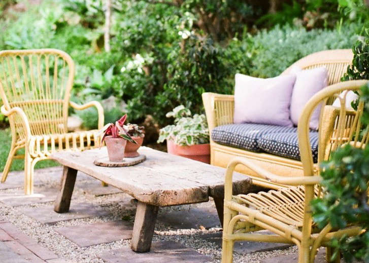
Just because outdoor furniture needs to be durable doesn’t mean it should be uncomfortable. Weather resistant doesn’t have to be hard, scratchy, splintery, or cold. Choose chairs with wide seats and sofas deep enough to sink into with a good book. Be generous when it comes to padding: cushions and pillows add comfort.
Arrange an outdoor seating area as if it were a living room. Make sure there are tables on which to set glasses and armrests on chairs.
Plant a serene palette.
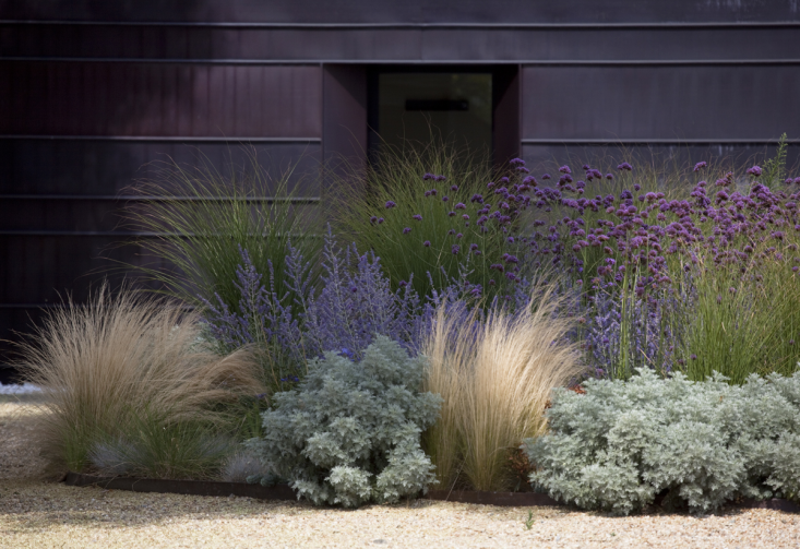
A good rule is to pick a three-color palette (plus white-flowering plants as an accent). For more of our favorite plant color schemes, see Garden Visit: Vita’s Sunset Garden and Color Theory: 10 Perfect Plant Combinations.
Pare down hardscape.
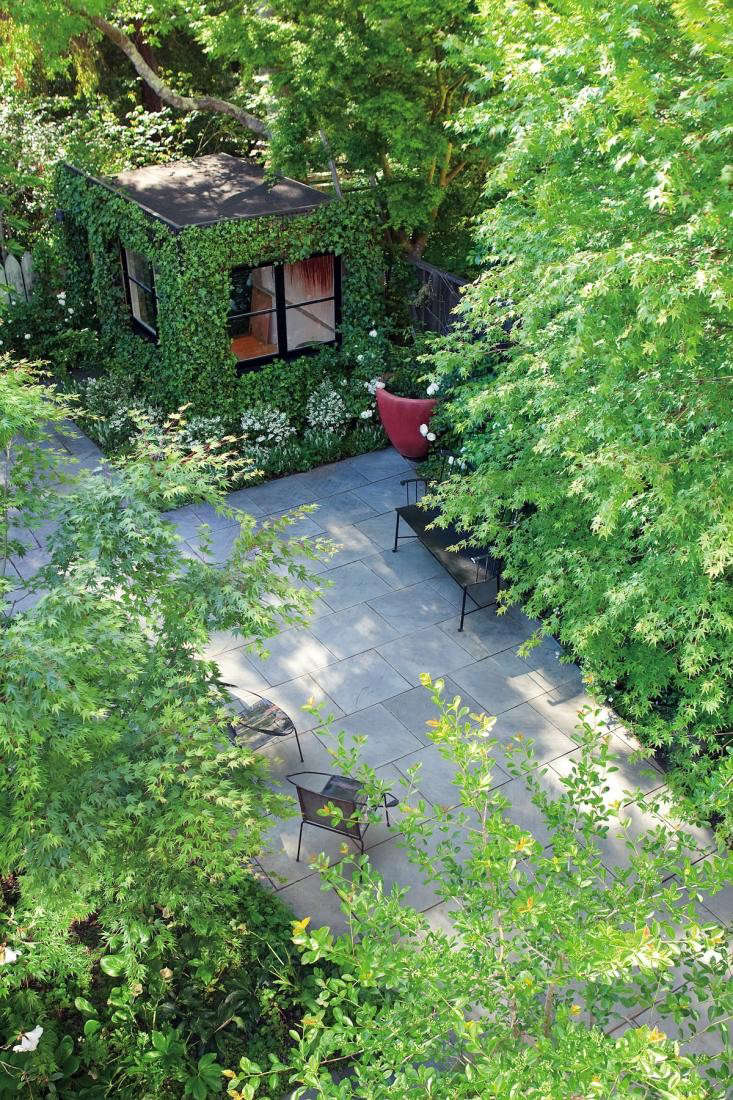
Don’t make the mistake of installing hardscape materials that clash. The color of your deck and front path should complement the color of your roof and your front door. Limit the number of materials you use and when laying brick or stone in a pattern, remember that quieter is almost always better. For example, bluestone pavers laid in a simple running bond pattern (shown) create a soothing backdrop to allow plants to steal the show.
Focus on foliage.

Don’t buy plants for their flowers. Buy plants for their leaves—texture, shape, color—because their leaves are what you are going to see most of the year.
For more landscape tips and garden design trends, see:
- 10 Best Garden Design Trends for 2018
- Trend Alert: Instant Rollout Fences
- 10 Best Garden Design Trends for Fall 2016
- Hardscape 101: A Complete Guide to Successfully Designing a New Landscape Feature


Have a Question or Comment About This Post?
Join the conversation